Sunday, May 10, 2009

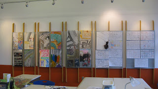
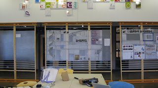
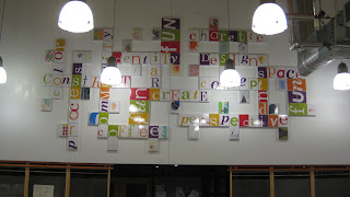
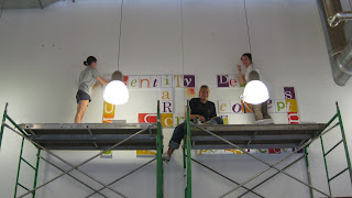
GAMMA installation

As a side note to this blog, I'd like to say as a girl in the greek society I have not been able to keep up with all of these Greek letters being our project- for all i know this isnt even the gamma installation-who knows!

Way to wrap up the semester. I will admit, I am green with envy that the younger years will be able to enjoy this space, when we put in all the sweat to make the studio a more livable space-because yes, we do live in it. 

Throughout all the troubles we had within this space, the project, installation and overall outcome of this studio was a huge success. I think that we would have had a more community 
 studio this semester if we had this space at the beginning. The space reminds me terribly of our first year in McIver, and I remember saying to myself when we moved into Gatewood 2nd year- WOW this building is great-but I loved mcIver, and I really did. McIver was an inspiration for most of us throughout this project, we wanted to bring back the openness of the space and the ability to see everyone working or goofing off within the studio. We achieved that as well as a bit of privacy throughout the loewenstein panels.
A JOB WELL DONE!


the end of NGHS

Its been a bumpy and wild ride for me with NGHS, rather just designing institutional for that matter. I was hoping to walk into this semester and be uber excited about the project at hand and just hit the pavement ending my senior year with a bang, I didnt quite have that, being that I dont have a passion (or mojo) for institutional design. I struggled quite a bit, but focused on my goals which I had made for myself at the end of the semester, which was doing research on institutional design and really REALLY working on my hand drawings and hand renderings. Once I was finally able to get some passion back into my soul for this project, after loosing it for awhile, I am proud of my work, and proud that I followed up on my goal and really concentrated on hand drawings, not tracing, not computer aided, but actual pure-hand-take me forever to draw-drawings. Below are 3 of my 4 hand drawn and hand rendered images for the NGHS project


Thursday, April 23, 2009

Can-Tastics take 3rd place!

I was right when I posted last night, or rather this morning about how there was really no organization or strategy to the CAN ART..however, it seemed to work out, as it always does because TEAM CAN-TASTICS took 3rd place..yea yea, even over MARIO!

It was a little rough of a beginning, most slurping up some sort of caffeine, scurrying around trying to find anything and everything that we could possibly use for "fasteners". Patrick in his hat (odd) and a wagon-like pully, rolled all the cans down to the weatherspoon art museum, where the "magic" took place. 


Like always, we did a bunch of trial and errors, a can-scape, a land scape, and other various attempts when we finally found joy and hope in taking the title with the 'tree of life' or 'cans of life'. Love how it relates so well back to studio and our concept - a TREE.


We never imagined we would win a prize, I will admit the competition was pretty intimidating with a ROBOT, MARIO, the 'SPIRAL' and other can-pieces. In the end we prevailed and took 3rd place, well deserved I suppose for the attempts we made and the passion we had for that tree?  

Anywhoo...I guess Patrick was right, we did have FUN DAMNIT! and it was nice to get away from studio for a little bit...

OH YA. and POTTED PORK!

Wednesday, April 22, 2009

Can Sculptures...FUN FUN FUN!

So, this week there have been many of times where I have questions the way I have gone about my final project..Hand drawing..hand rendering..Really? Shannon + Hand..anything takes forever. And although it HAS taken me FOREVER..and I am now only done with 4 perspectives I am starting to feel more confident in my choice. Hand drawing..and hand rendering..hand ANYTHING..was what I wanted to focus on this semster..not..do it in the computer and trace..pure hand..and it has been somewhat of pure hell, however, I did and I am pleased with my hand drawing skills.

On my breaks from being frustrated I have been thinking and been enthrawled with the next task to complete (not that the first one is done..) the CAN ART. Brillant idea, however, not a brilliant time. I feel as if we have no idea what is going to take place tomorrow and honestly I dont know who is going to participate..but Patrick is shooting for the moon on this and I think we should shoot for the moon too. He has come up with some creative ideas, and we have finally reached over 40 cans...I think were at 187..so we will have an abundance of canned items to make a wonderful can-ulpture. * not as creative as patricks..*

heres what I am expecting from 412 (patricks studio tomorrow..)


Thursday, April 16, 2009

etched glass-forest like?

"Banners"...are they to 'market-down town' theme? yes, probably so. Trying to find the balance between forest and down town was hard to come by - so another tweak in the design has occurred. This always tends to happen, especially now that I have senioritis, I tend to stand by and tweak and add small things to the space early on in the design process when theoretically I should lunging myself forward and stepping in all sorts of crazy directions of design and then subtracting. However, I suppose I work backwards....

The 'banners' in my space have now turned into a series of etched glass panels, which allow a more tactile experience for the students and the occupants of the space. I imagined myself in this college forest I have created and how it is lacking the tactile experience. When in a forest you touch leaves, twigs, the dirt on the ground, its a never-ending series of exploring and touching, and those are the qualities I want the occupants in the space to have. 

late night discoveries


So while sitting in studio late night, sipping on a red bull to keep my mojo going, i have made a few realizations about the college area. Where is the horizontal elements? No where. Have I manipulated the ceiling? the floor? NO.
So, I did a few quick perspectives of ideas to help the space become more vibrant and more appealing. I have added a grid like-branching pattern to the ceiling that will serve as in-set lighting to help give a little more life to the space. The grid on the ceiling will be continuations of the systems of way finding and storage as well as the shelving system that span through out the walls and columns.

Another idea I am focusing on, is the desk situation, after sketching desks and trying to force something to work as not only a desk, but rather a table I have decided to have the desk cantilevered off of the column and given support from thin metal poles (like the ones in the systems) to help with the horizontal elements as well as the vertical lines.

So far late nights + red bull + a little cheer leading from peers has helped convert my space into a better interactive experience.

Tuesday, April 14, 2009

'being excited...coming a lonnng way...'


After discussing + sharing ideas in class on weds, I realized I:
a. had a lot of work ahead of me
b. dont have too much time ahead of me
c. need to get my 'mojo' back (it tends to come and go quickly during this project)
d. get excited about my designs thus far + those of them to come

So, I spent the weekend back home in Ohio, and it was nice to clear my head a little bit of all my tasks and figure out ways to climb myself out of this hole I have somehow dug for myself. I did some sketching over the weekend, and started working on perspectives. I came back on Monday and finally put the pencil to the paper and started to feel as if I was getting something accomplished, and am currently getting excited for the space (or the fact that I am making progress).

The perspectives above need a little touch up on the renderings, however, I believe this is where my final design is going. I want to incorporate more color into the space, and work on lighting techniques to help light the "forest" and make it more visually stimulating. I like how the stands have created an array of 'tree-like' objects and when moving throughout the space you feel as if you are in a forest, but can easily locate where you want to go, by the way finding systems.

The nook in the second image has been fixed to be more useful to the students as well as more engaging. Again, I would like to work on lighting techniques to help aid the students in way finding and make it more visually stimulating. The objects hanging from the ceiling are smaller versions of our LEED signs that will be taking place in the rest of the circulation space. Within the hanging signs will be clips and images of colleges. They will be made out of recycled glass and metal, *more to come on signs later*.

I guess its not so bad working within an institution - I just have to allow my mind to be creative in other ways + I am working on 'designing outside of the box'.

"You should be excited, this is a cool space." + today I can say I actually am excited.